
After the strong finish to 2023, economists wondered what the U.S. economy could possibly do for an encore in 2024. After all, given the challenges of a declining money supply, an inverted yield curve and a number of other headwinds, the acceleration of the Gross Domestic Product (GDP) was, in a word, impressive. At least that is what the official data would like for us to believe.
Unfortunately for the administration, the average consumer doesn’t seem to believe in their apparent good fortune. How else could you explain the persistent public opinion polls showing that the majority of Americans believe the country is headed in the proverbial wrong direction? [see: www.realclearpolling.com/polls/state-of-the-union/direction-of-country] . After all, if things were going as swimmingly as Washington says they are, why are so many people so glum?
Simply put, there is a disconnect between what the government is telling us and what the average everyman’s family is experiencing.
CONSUMER SENTIMENT ISN’T WHERE IT SHOULD BE

As most people know, the Federal Reserve has a dual mandate. The first is to maintain price stability, and the second is to achieve full employment. Essentially, Washington has put the central bank in charge of setting monetary policies that keep everyone working without triggering a commensurate increase in consumer prices. If that sounds like a pretty neat trick, it sort of is.
CONSUMER PRICE INDEX
So, how is the Fed currently doing? If the Bureau of Labor Statistics (BLS) is accurate, as of February 2024, the official Unemployment Rate is 3.9% and the trailing 12-month Consumer Price Index (CPI) is 3.2%. The latter is a marked improvement from February 2023, when it was 6.0%. So, we would have to give the Fed high marks, wouldn’t we?
If we all lived in a relative world, perhaps so. However, since you can’t fold or spend a relative dollar, I would argue we don’t. People deal largely in absolutes when it comes to their livelihoods.
To that end, what solace is a 3.2% CPI when it was 6.0% in February 2023 and 7.9% in February 2022?
After All, prices aren’t going down. They are simply increasing at a decreasing rate.
Over the past three years, from February 2021 to February 2024, the U.S. CPI Urban Consumers index has mushroomed from 263.583 to 311.054. That is an aggregate 18.01% increase, or 5.68% when annualized.
To test this out, I went back to some historical data that Sam Clement and I compiled in 2021 and 2022. Back then, we created two different “grocery store” indices. One tracked the “cost of living” (COL) using prices from Walmart.com, which included essential items you have to buy whether you like it or not. Items like laundry detergent, shampoo, Kraft Dinners, paper towels, sandwich bread, milk, ground beef and other less-than-fun stuff.
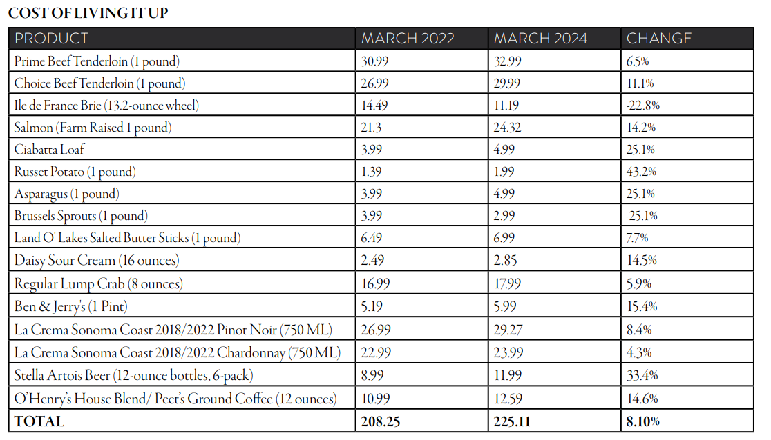
The other list focused on so-called “cost of living it up” (COLU) items from a local upscale market. These would include things like filet mignon (prime and choice), lump crabmeat, La Crema wines, Stella Artois beer and other potential ingredients for a special meal. Not your boring Tuesday night “breakfast for dinner” sort of thing.
Over the past two years, a few items in the series have either been discontinued or have changed. For example the standard Suave shampoo size in the COL basket has dropped from 30.0 ounces to 22.5 ounces. In the COLU index, the available La Crema Sonoma Valley wines are now the 2022 vintage, not 2018. When there was a discrepancy or missing item, I tried to use the most suitable replacement or alternative available.
That is also what the BLS does when calculating the CPI. The first table below is from data I collected on Walmart.com for zip code 35209. The 2nd is from a specialty market located in zip code 35223.
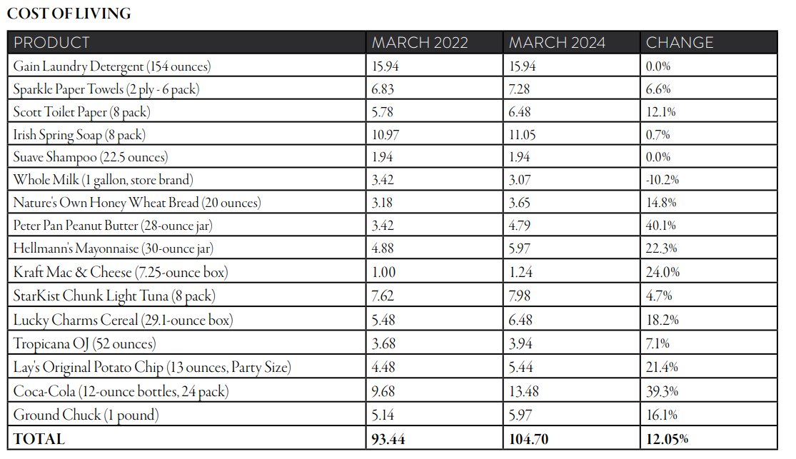
What I found wasn’t too terribly surprising. The cost of beef remains high but seems to be cooling off a little bit. Alcohol has gone up in price, as has pretty much everything made from grain. However, where the rubber meets the road, the COL basket, which includes the relatively inelastic items, was up 12.05% from March 2022 to March 2024. That is an annualized rate of 5.85%.
On the flipside, and quite unexpectedly, the COLU list saw an increase of 8.10%, which translates to an annual average of 3.97%. That is an almost 2% annualized difference, which isn’t insignificant. All the more so when you remember that basket of boring essentials has risen in excess of 12% over the past two years.
As such, this little survey of mine suggests the cost of living is going up faster than the cost of living it up.
This would certainly help explain why the American public is more sour on the economy than the administration would like for it to be.
EMPLOYMENT
Then, there is the whole issue of employment. We have been hearing about the strength of the labor market for years. However, at this time, just how strong is it really?
Since May 2020, with the exception of December of that year, the BLS has announced that the U.S. economy has added payroll jobs every month. While that alone isn’t overwhelmingly impressive, the lowest monthly observation has been 136K net, new jobs, which occurred in December 2022. Further, the economy continued to create jobs at a
relatively rapid pace after the Fed started raising the overnight rate.
During February 2024, the BLS reported the economy created 275K new jobs. To put that number into perspective, the 40-year average is 135K per month. As such, inarguably, employers have been adding to their payrolls at a relatively feverish pace since the worst of the pandemic. Of course, they shed a lot back in the first part of 2020, too.
Where does the data come from?
- Most people don’t know the BLS conducts two surveys each month for their labor data. The first is the Establishment Data, which is as the name implies and from where we get the headline jobs created number. It’s a payroll survey. The BLS calls employers and asks them whether or not they have been hiring people.
- The second is the Household Data. This is also as the name implies and is a population survey. The BLS calls individuals and asks them about their employment status. Ordinarily, these two surveys would move in the same general direction, even if their absolute numbers didn’t agree.
The Establishment Data focuses on jobs at businesses and government agencies, while the Household Data focuses on the employment status of individuals. One last thing, the Unemployment Rate comes from the Household Data.
As a result, the monthly Employment Situation report, arguably the most important economic release, is a mixture of apples and oranges.
Recently, there has been a growing gap in the two surveys. Due to axis scale problems caused by the massive job losses in March and April 2020, the chart below doesn’t best illustrate the current wide disparity. Unfortunately, the best way to describe it is to give you the data.
PAYROLLS OR HOUSEHOLDS? WHO IS TELLING THE TRUTH?

In December 2019, just prior to the pandemic,
- The Establishment Data suggested there were 151,792K jobs in the U.S. economy.
- By comparison, the Household Data reported there were 151,909K.
- This is a relatively slight 117K difference, which is basically a rounding error given the size of the U.S. workforce.
Fast-forward to February 2024, a little over four years later:
- The Establishment Data suggested there were 157,808K jobs.
- By comparison, the Household Data reported there were 153,985K.
- This a gap of 3,823K payrolls or jobs, which ceases to be insignificant.
What’s more, the Household Data suggests employment recently peaked in November 2023 at 155,459K. As such, if American households are to be believed, the U.S. economy lost 1,4574K jobs over a three-month time frame ending in February 2024.
Conversely, the Establishment Data has suggested the economy created an additional 794K payrolls over that same time frame.
Clearly, that is an awkward 2,268K job differential between the two series in such a short period (1,457K + 794K).
If that weren’t enough of a head-scratcher, since the end of 2019, the BLS has reported 6,016K net, new payroll jobs from the Establishment Data. That is a not quite triple the 2,076K job growth from the Household Data. Clearly, something appears to have broken down in the BLS’s methodology. Outside of the bizarre economic data from 2020, the current disparities in the data sets are unprecedented.
Whew. I’ll admit those last few paragraphs were a confusing read. However, trying to make sense of all the conflicting economic data has been equally baffling. Further, sometimes your eyeballs and ears know what they know.
For instance, the BLS currently estimates there were 8,863K job openings in January 2024. While down considerably from March 2022’s all-time high of 12,182K, the January total is still historically high. Prior to the pandemic and its economic fallout, the highest reported number of openings was 7,594K in November 2018.
What’s more, the monthly average since the series inception in December 2000 through December 2019 was 4,489K. Therefore, January’s number of job openings was roughly double the pre pandemic average. As such, it would seem there are jobs littering the streets.
Perhaps.
Although the number of job openings always gets the headline, the more meaningful number is the so-called Hires Rate. This is effectively the total number of gross hires divided by the total number of jobs. The higher the number, the hotter the job market. For instance, in May 2020, as the labor markets rebounded from April and March’s shutdowns, the U.S. Hires Rate was a massive 6.1%. The most recent observation, January 2024, was 3.6%, whereas it was 4.1% and 4.3% in January 2023 and 2022 respectively.
HIRING IS BACK TO NORMAL, MAYBE EVEN SLIGHTLY WEAKER

By this measure, the jobs market is basically back to historical norms. Employers still have plenty of job positions available, but they are filling them at a much slower pace. If they can find their unicorn, great, but they aren’t in a huge hurry to throw warm bodies at open positions. Trust me, if you are a college senior trying to find a job, you are painfully aware of this.
Combined, the labor market is okay. However, it isn’t as red-hot as it was OR as white-hot as the media would suggest. Couple this with persistently high inflation, especially for the “un-fun” inelastic goods, and you have a pretty wide disconnect between what economists are saying and what the public is feeling.
It should be interesting to see who is more right as the year goes along. In case you want to track the results at home, just follow that link from the second paragraph, and you will have a pretty good idea of who the winner will be.
This content is part of our quarterly outlook and overview. For more of our view on this quarter’s economic overview, inflation, equities and allocation read our entire Annual 2023 Macro & Market Perspectives.
The opinions expressed within this report are those of the Investment Committee as of the date published. They are subject to change without notice, and do not necessarily reflect the views of Oakworth Capital Bank, its directors, shareholders or employees.